$290,000 revenue increase with shopping cart improvements
- Nov 7, 2025
- 2 min read
Updated: Apr 23
Overview
UX in collaboration with Marketing decided to update the login and shopping cart.
Problem
The purchase funnel for Accounts.LAZ was underperforming, with a CVR of 1.10% and significant drop-off at login and cart steps—two critical conversion points in a high-intent flow. This represented a direct revenue constraint on a core growth surface.
Role: Lead UX Designer. Product Manager

Funnel Context
Order Start → Login (orderLogin.do) → Cart (cart.do) → Checkout → Summary
Largest drop-offs observed at:
Login (identity friction)
Cart (interaction + decision friction)
The summary was a natural place for users to abandon as it was the post purchase summary and lead users to their email where, for security and legal reasons, they needed to confirm account creation.
Hypothesis
If we remove unnecessary decision points at login and simplify cart interactions, we expect more users to reach checkout, increasing CVR from 1.10% → 1.265%.
Why This Work Was Prioritized
High traffic, high intent funnel stage
Direct tie to revenue (conversion)
Clear, observable friction points
Faster to implement vs. deeper platform changes
Measurement & Goal

Method of CVR Calculation:
Only using Accounts.LAZ (non-consolidated) GA data
Current CVR (May 10-July 7) = 1.10%
Goal to improve by CVR by 15% = 1.265%
Key Interventions
Old Login Pages

Intervention: Remove unnecessary decision friction at login
Eliminated non-functional radio button step that did not impact downstream behavior
Replaced with standard login / account creation pattern aligned with e-commerce norms
Positioned returning user login more prominently to reduce duplicate account creation
Expected Impact: Faster progression into cart and reduced abandonment at login
Updates to Login

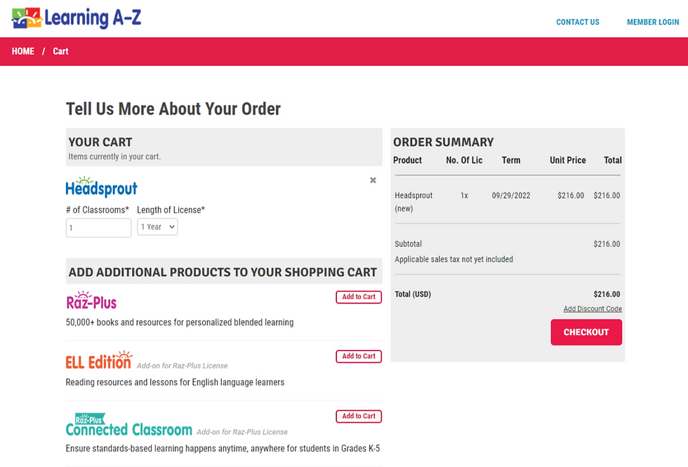
Old Shopping Cart

Intervention: Align cart interactions with standard e-commerce patterns
Replaced non-standard selection controls with familiar add/remove patterns
Reprioritized visual hierarchy to emphasize “Checkout” as primary action
Reduced visual noise (disabled products, over-prominent discount field)
Expected Impact: Increased checkout initiation and reduced hesitation
Tradeoff Considered
De-emphasizing discount code entry risked reducing coupon usage, but analysis suggested the distraction was suppressing overall conversion. We prioritized total CVR over coupon engagement.
Updates to the Shopping Cart
Results
Primary Metric
Conversion Rate (CVR)
Baseline: 1.10%
Target: +15% → 1.265%
Actual: 1.287% (+17%)
Secondary Signals
Decrease in duplicate account creation
Reduction in support calls related to account consolidation
Key Learnings
Removing non-essential decisions in high-intent flows has outsized impact on conversion
Familiarity (mental models) is not just UX polish—it directly affects revenue
Visual hierarchy strongly influences user action prioritization (e.g., discount vs checkout)
Small, targeted changes in critical funnel steps can outperform larger feature investments


