Accelerating Development Through Smarter Design Systems with YAML
- Oct 14, 2025
- 3 min read
The Design and Development teams worked together to create a Design System that revolutionized the product development pipeline at Paciolan.
The Design System contained design guidelines, visual component libraries, YAML theme files and React styled components.
Using reusable, styled components in React would allow developers to quickly develop, and using theme styled components would keep developers from worrying about the visual styles of the elements. The theme also gives Design the ability to own the theme in the code base. This allows Design to be able to update the look of the product more quickly and smoothly with very little developer intervention.
Understanding the needs
Development wanted to move to React as their code base, using React styled components.
Design wanted to update both the visual/ui of the product, as well as the ux patterns that just weren’t working well (not user friendly).
Design and Development agreed that it would be nice for Design to own the “look” of the product.
Setting the foundation
The Design team worked through not only the design guidelines (fonts, colors, grid, etc.), but also the visual style of all the relevant assets (e.g. buttons, cards, form fields, etc.)

A dilemma
The conversion to the upgraded technology (React) on the development side would be done in small release features over time (so converted by project as projects go through the pipeline). From a design standpoint, this created a challenge of when to actually upgrade to the new look as the new look was very different from the current look, and the product was already using 2 looks (closer in style, but still different and noticeable by the user).

A decision needed to be made
Since the conversion to React would be done in small release features over time a decision needed to be made as to when to update the look.
The options were:
Keep the current (Pac7 & Pac8) look until the entire product was converted to React, and then push the new theme.
Pros: Wouldn’t be a 3rd visual style added to the product. Less confusing for users as they navigate around the product.
Cons: Style not updated until conversion was complete (which could be years).
Use the new look going forward with any new project.
Pros: New, more refreshed, look.
Cons: 3rd style added to product. Could be jarring for users as they navigate around.
Additional consideration
Some of the interactions in Pac7/8 are not very user friendly and weird and needed to be updated. Click link to see example.
Decision
I was lucky enough to be able to be the one that made the recommendation for what decision to make, and make that decision.
What was decided, for the theme, was the look (style) would follow the Pac7/8 style so that the product wouldn’t be jarring for the user (and less user knowledge of what was updated and what wasn’t).
Caveat: Design was going to use new/better ux patterns, updated flows and better ux with any new project going forward so that the product was easier for the user to use and more delightful. The thought behind this was that users are less likely to notice better ux (since good ux goes unnoticed) but be delighted that processes work better for them.
Understanding the differences

Because the plan was to use the look of Pac7/8, and then convert to the new look after the conversion was complete, a guide was created so the Design and Development understood the differences in the theme and so that the theme styled React components could be created in a way to handle all the themes.
YAML files
Once the visual aspect of the components was complete, the lead React developer and I worked together to get the YAML file for the theme working. I wrote the YAML so that I would understand how it worked, since Design was going to own this theme file. A theme file was created for each look (i.e. Pac7, Pac8, and New)
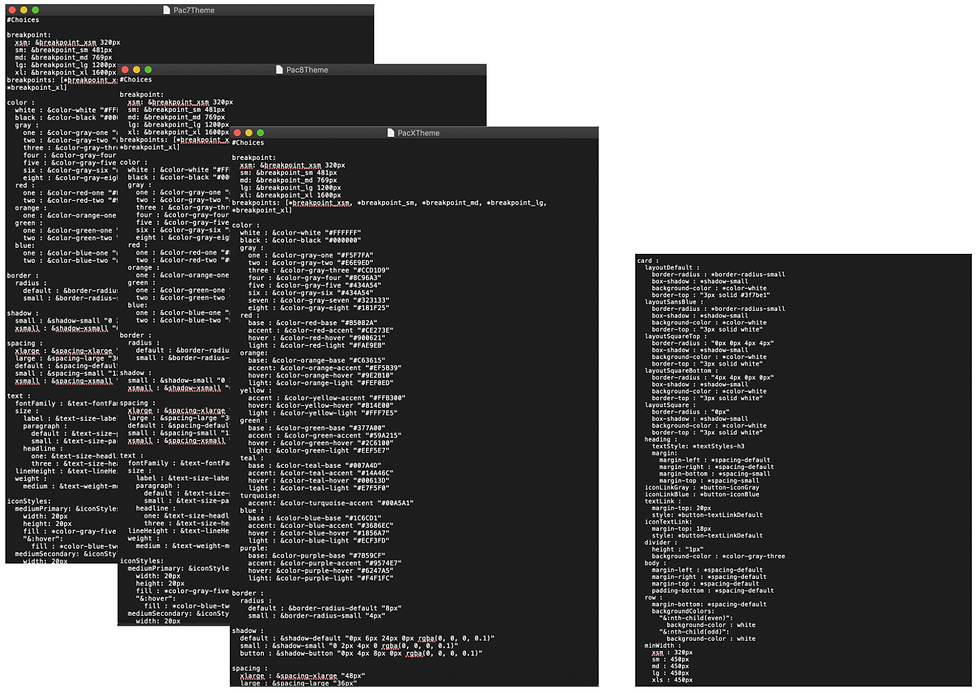
The theme files followed the same structure as the Design System with a section for base styles (e.g. fonts, colors, spacing, etc.) and then the components (e.g. buttons, card, select, etc.).

Storybook
Once a developer finished a React theme styled component, they documented the use of the component in Storybook, so this became the code part of the Design System.
What’s next?
The conversion is actively taking place. As more developers start using the theme styled React components, the components themselves are being thoroughly tested and iterated on.
Paciolan is a SaaS company. The React components have gone over so well on the Enterprise side of the business, that the teams on the consumer side of the business also want to start using them. There will be a “consumer” theme that Design will create, but since the hard work of the component creation was done up front, the use of the new theme should be smooth.


